Swap Spot
Turning clutter into community: Rethinking consumption one secondhand treasure at a time!
Inspiration:
The inspiration for the Swap Spot project stemmed from a desire to enhance the sustainability and efficiency of community exchanges. The team was motivated by the innovative approach of The Buy Nothing Project, which encourages the free exchange of goods to reduce waste. However, the limitations of existing platforms, particularly their reliance on outdated social media like Facebook, sparked the idea to develop a more accessible and secure platform that aligns with modern user needs and safety concerns.
Problem:
The Swap Spot project identified several key issues with current secondhand exchange platforms. Firstly, the reliance on Facebook for community-based exchanges is increasingly seen as outdated and limits user engagement. Secondly, these platforms often facilitate forced interactions that can be uncomfortable or unsafe, especially for vulnerable groups like young women. Lastly, many existing secondhand platforms are overpriced and do not genuinely promote sustainability, undermining the potential environmental benefits of secondhand trading.
Solution:
The proposed solution was to create a kiosk-based exchange system that could address these issues by providing a safer, more accessible, and user-friendly platform. The kiosk would facilitate the local exchange of goods without monetary transactions, using technology to ensure secure and efficient interactions. This system aims to empower users to engage in sustainable practices while enhancing the overall user experience and fostering a sense of community
My Role:
Researcher: Conducted on-site interviews at thrift stores, libraries, and parks to understand user habits and pain points related to second-hand commerce and community engagement.
Service Designer: Created and tested user journeys and workflows to ensure smooth transactions, addressing issues like scheduling and safety.
UI/UX Designer: Sketched initial layouts and created low-fidelity wireframes to visualize user interactions. Used paper prototyping to test and refine the flow of screens for key actions.
Prototyping Contributor: Designed the physical kiosk with features like compartmentalized storage and an interactive screen. Assisted in building a cardboard prototype for testing and contributed to the high-fidelity design, branding, and final assembly of the kiosk.
Conceptualization
Research
We engaged in thorough research to ground our Swap Spot project in solid evidence and user insights.
Online Research
We reviewed several academic articles, with particular attention to Give the Users What They Want: Elevating the User Experience of the Buy Nothing Project by Chantal Leslie. This paper highlighted critical issues such as Facebook's diminishing relevance for community exchanges, user safety concerns, and questionable environmental benefits of the existing system.
The insights from this research emphasized the need for a newer, safer, more modern platform that is also easy to use and promotes environmental consciousness.

Site interview locations selected for insights on second-hand shopping.
Paper we reviewed for background information on the topic
Field Research We conducted field observations to directly understand current sustainable practices:
Locations: We chose thrift stores, public libraries, and parks for our observations due to their relevance to community-based sustainability activities.
Observations: We took note of how these spaces were organized and how people interacted within them, which helped us visualize where and how a kiosk could fit into these environments.

Online Surveys
Design: We designed an online survey to gather broader quantitative and qualitative data on user behaviors and preferences. It included Likert scale questions to measure satisfaction levels and open-ended questions for comprehensive feedback.
Distribution: We shared the survey through social media and email channels with members of Buy Nothing groups.
Focus: The survey aimed to confirm the qualitative insights from our interviews and provide data to guide our design decisions. Example questions included:
How satisfied are you with current secondhand exchange platforms?
What features do you think are missing that could enhance your experience?

Commonly transacted goods

User Persona Background
Example our user persona Kate, her situation highlighting key struggles, and a visual representation of her story:


Low-fidelity sketches of the physical kiosk design
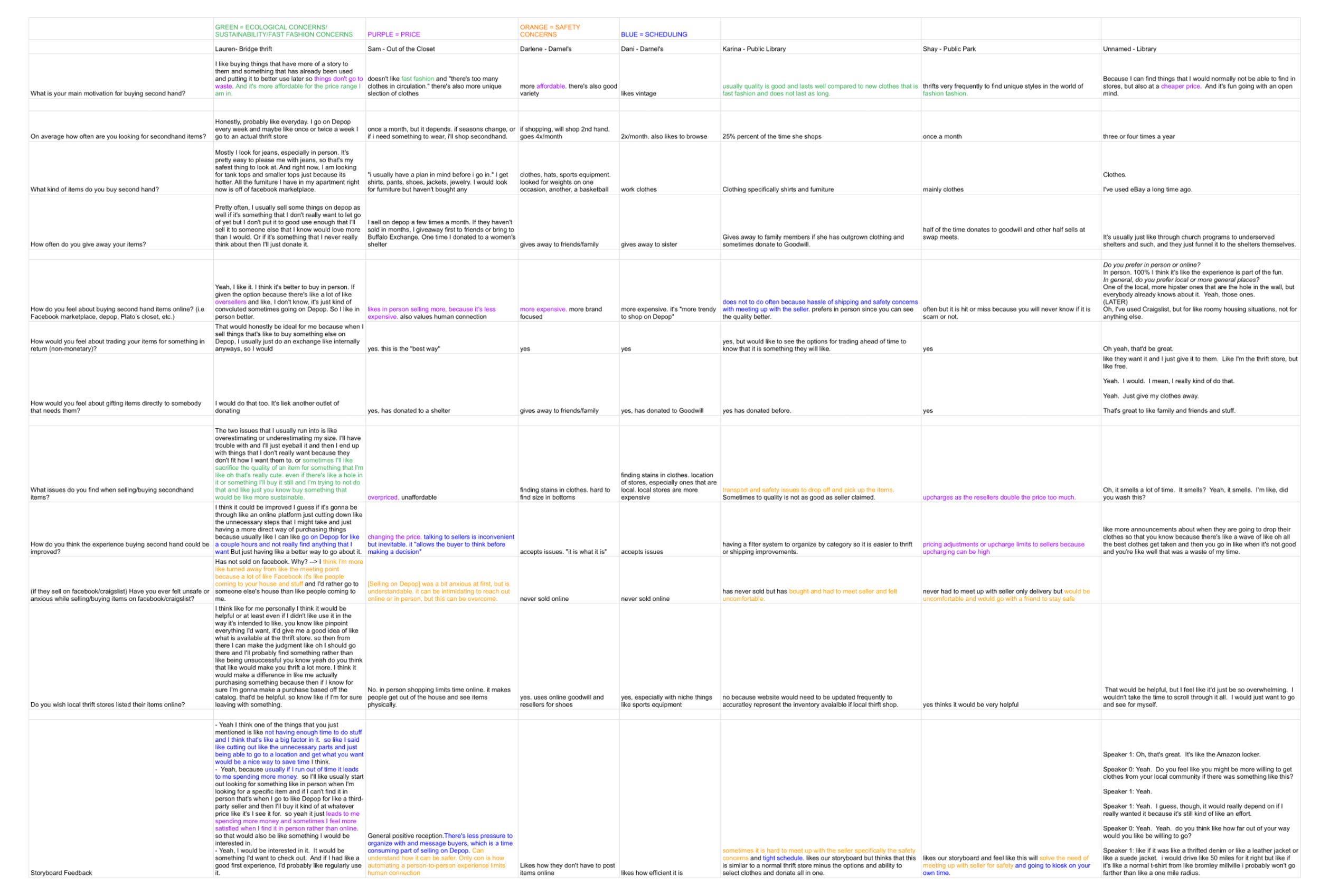

We coded our data into themes of price, time, safety, and eco-friendliness using a color-coded key


Situation
Survey results on pain points
Interviews We collected deeper insights through detailed interviews:
Participants: We talked to various users who frequently shop secondhand or use community facilities.
Questions: Our questions aimed to uncover their habits regarding platforms like Buy Nothing, their feelings about these platforms, and their personal safety concerns during exchanges. Some questions we asked included:
How often do you engage in secondhand exchanges?
What do you like or dislike about using platforms like Buy Nothing?
Have you ever felt unsafe during an exchange, and what could make it safer?
Using Personas: By introducing personas like Kelsey, a college student, and Kate, a small business owner, we helped interviewees relate their experiences to specific scenarios. This approach provided us with clearer, more targeted feedback on the kiosk design.

Interview guide detailing the questions we prepared for our site interviews
This blend of direct interviews and broad surveys gave us a well-rounded understanding of the community's needs and expectations, ensuring that our kiosk design would effectively meet user demands and improve the overall exchange experience.
Ideation
During the ideation phase of the SwapSpot project, we drew inspiration from the Amazon Locker system, particularly its capability to enable secure transactions without requiring direct cross-user interaction. This element is vital for enhancing safety and privacy in a community-sharing environment.
Our design objectives centered on creating a kiosk that allows for secure, private exchanges by allowing users to pick up and drop off items independently, without the need to meet or interact directly with other users. This approach minimizes potential safety concerns associated with face-to-face interactions during exchanges.
Adapting the non-interactive exchange model of Amazon Lockers, our kiosk needed to accommodate a wider variety of items typically shared in community settings. This consideration influenced decisions regarding the kiosk's size, strategic placement, user interface, and security features, ensuring it was accessible and easy to use while effectively serving the community's needs.
User Personas
To guide our design, we developed detailed user personas that represented typical members of our community. These personas included Kelsey, a college student who values convenience, safety, and sustainability but has faced challenges with no-shows and complicated exchanges. Another persona, Kate, is a small business owner seeking efficient, cost-effective ways to acquire supplies for her business. These personas helped us pinpoint specific needs and design features that would make the kiosk more user-friendly and relevant to our community.

Storyboard

Development
Design & Prototyping
Low-Fidelity Prototyping
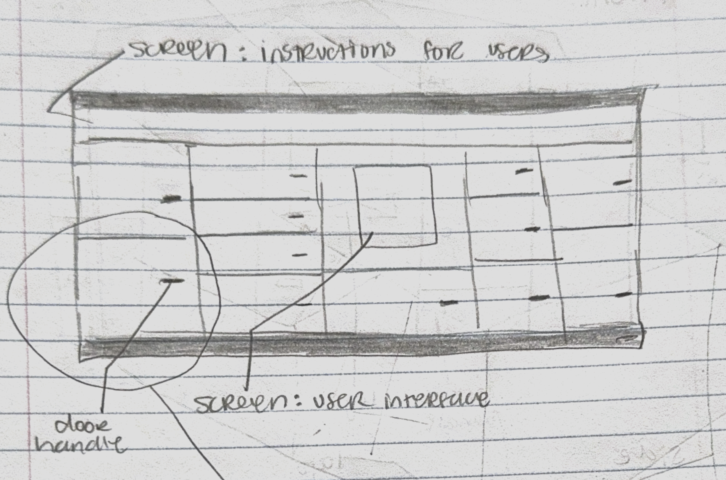
Physical Kiosk: We started with hand-drawn sketches to map out the basic structure and features of the kiosk, such as various-sized slots and an interactive control screen for the locker doors. This initial phase helped us visualize the kiosk's functionality and basic user interactions.
UI: At the same time, we sketched out initial layouts for the user interface, focusing on the three main actions required for transactions. To make sure the flow between user actions was logical and intuitive, we used paper prototyping to test and refine the order of screens, ensuring the core functions were simple and easy to access.
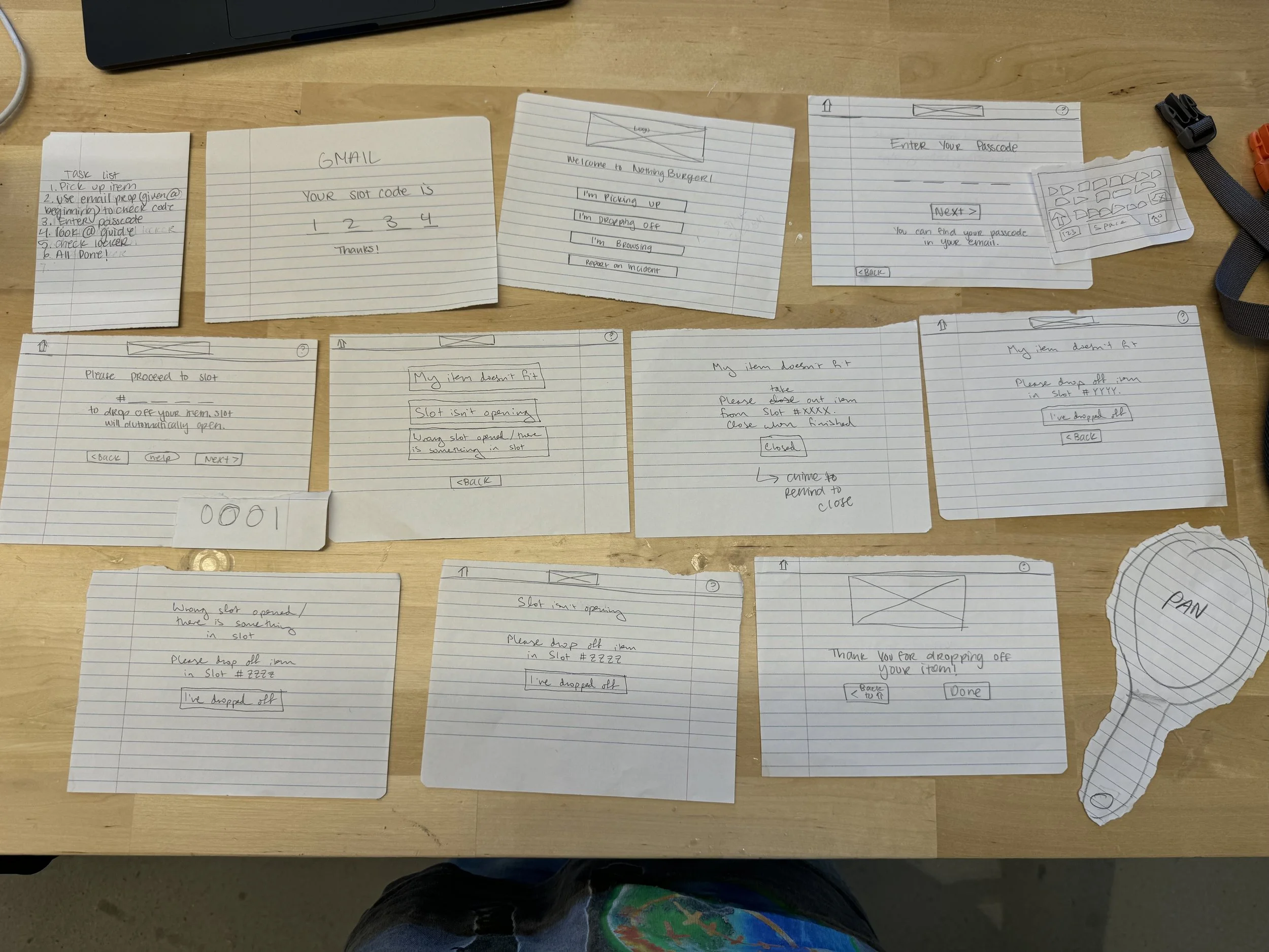

Refined the user flow through testing with paper prototyping

Mid-Fidelity Prototyping
Physical Kiosk: Using cardboard models, we began to bring our sketches to life, constructing a tangible version of the kiosk. This allowed us to test the physical interaction elements, such as the size of slots and the ease of access to compartments.
UI: We transitioned our initial sketches into digital wireframes on Figma. These wireframes remained colorless and unbranded but were more detailed, enabling us to test and refine the user interface’s functionality. We conducted usability tests with these wireframes to identify any navigational issues and gather early user feedback.


Cardboard Prototype of kiosk design
Meet Team Nothing Burger! The masterminds behind Swap Spot.

High-Fidelity Prototyping
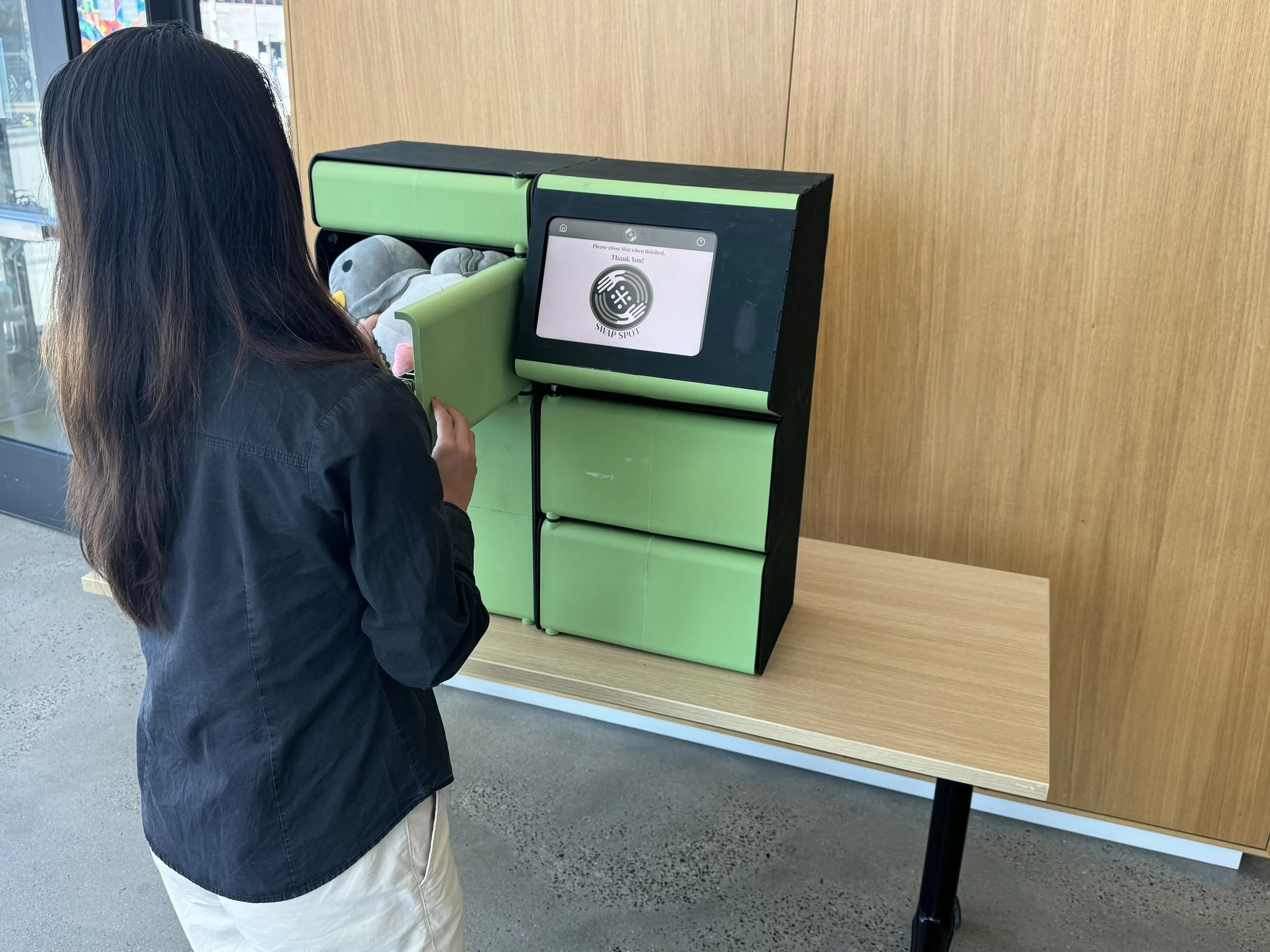
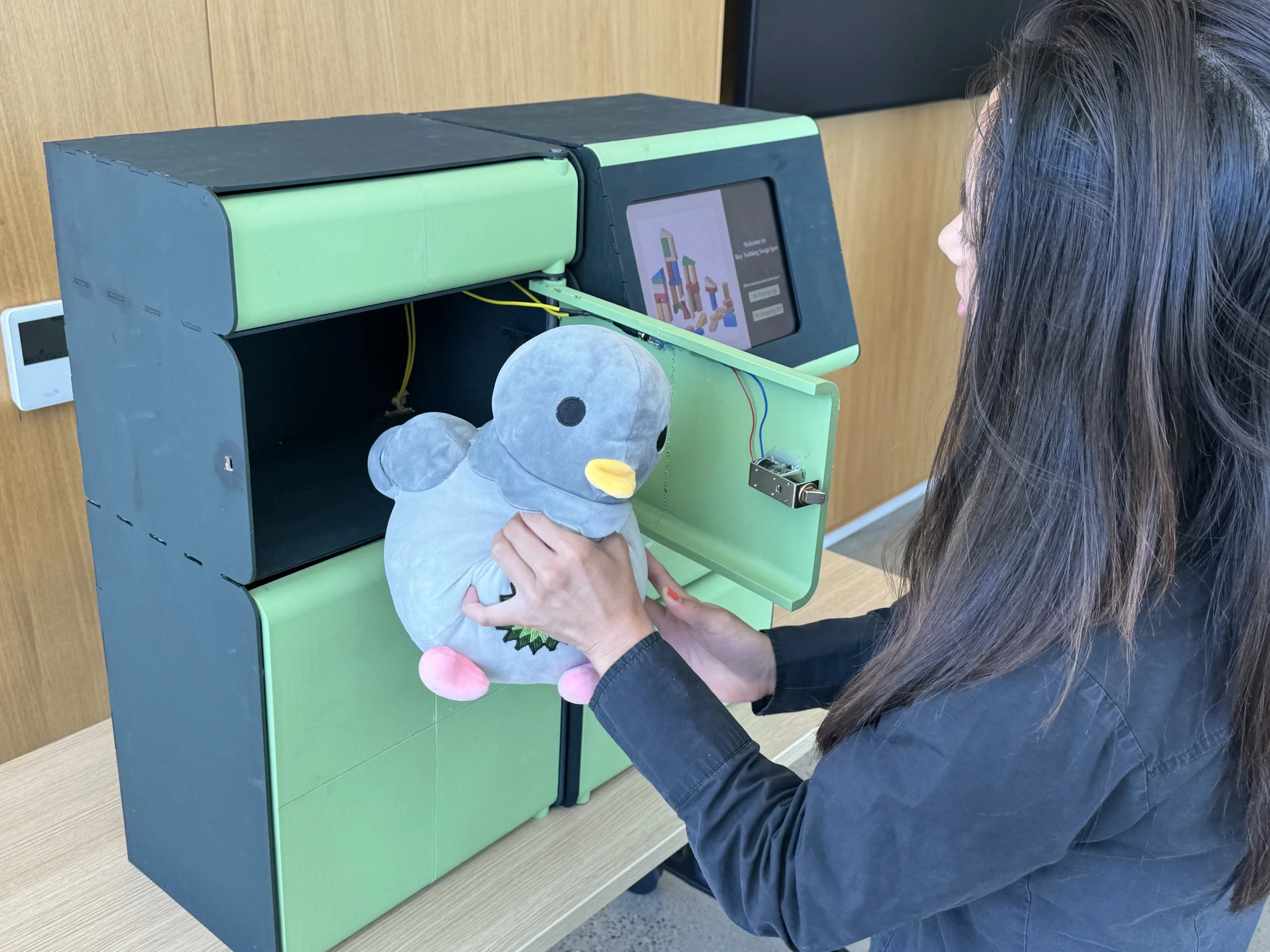
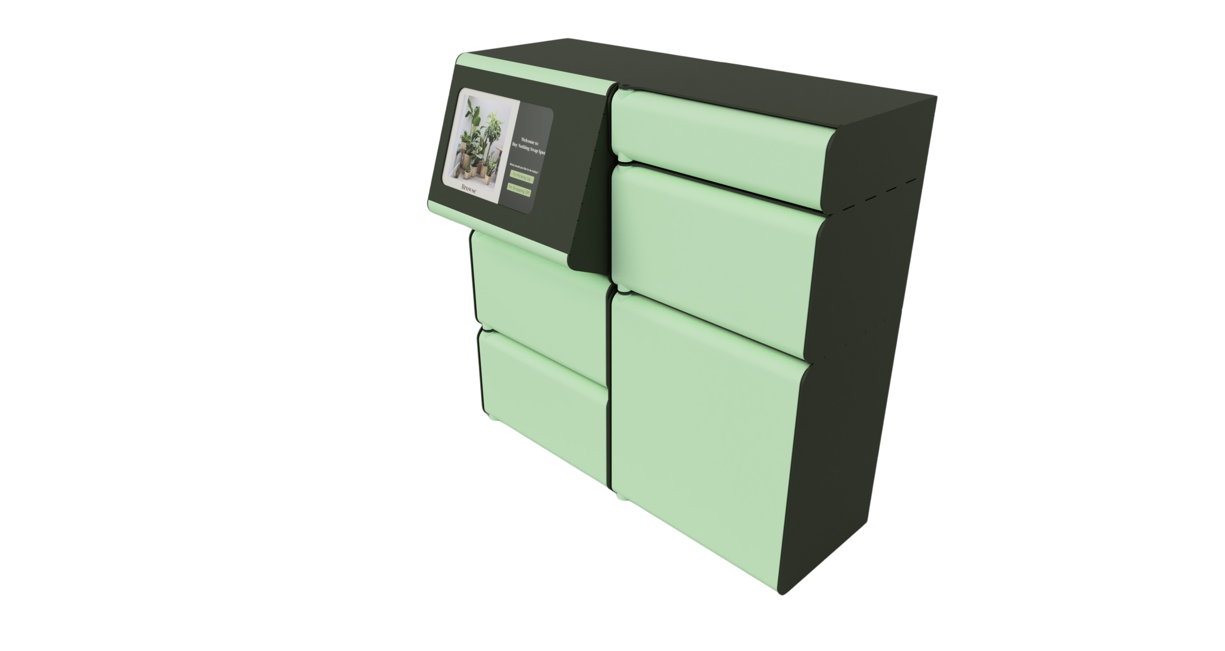
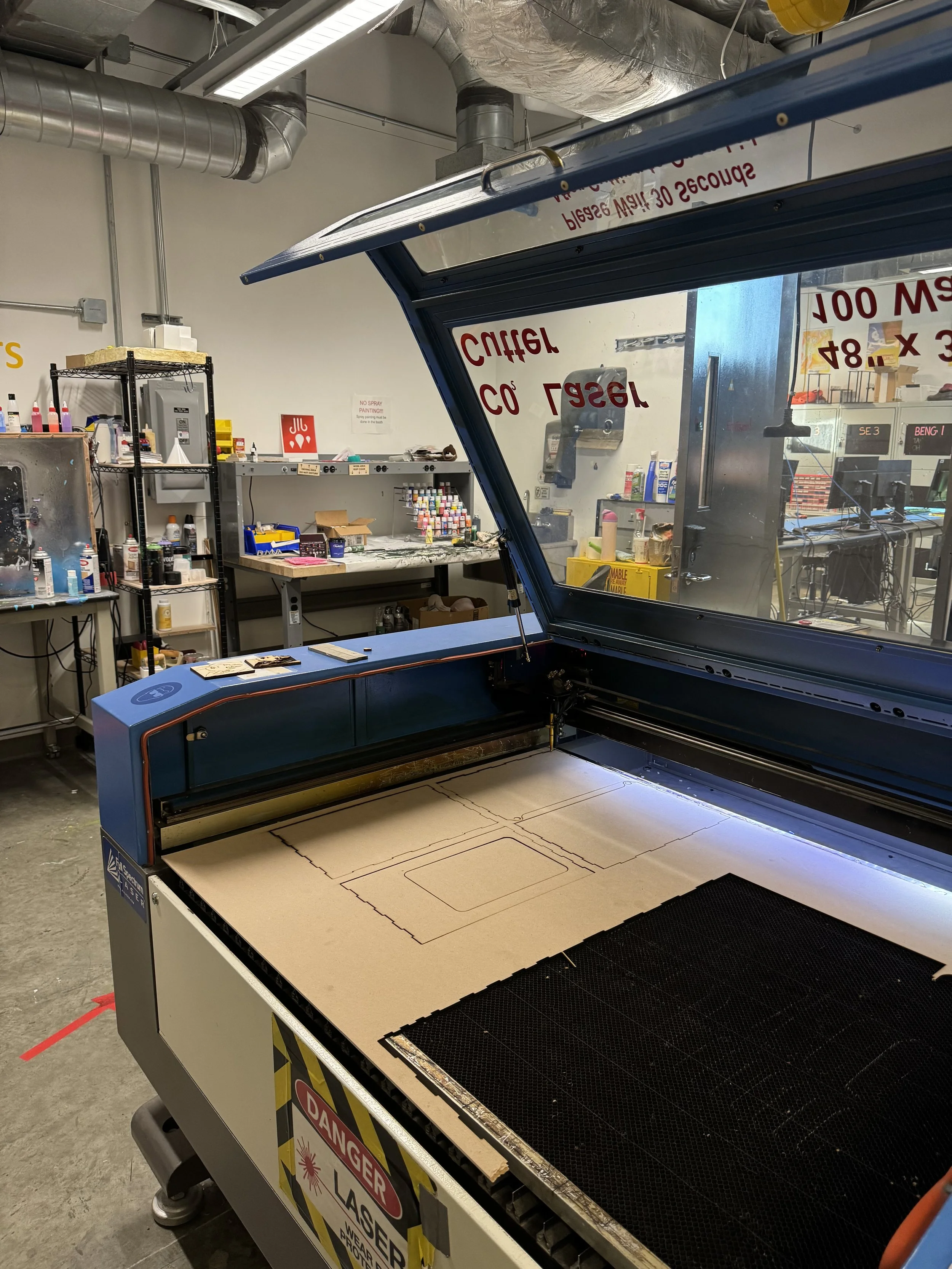
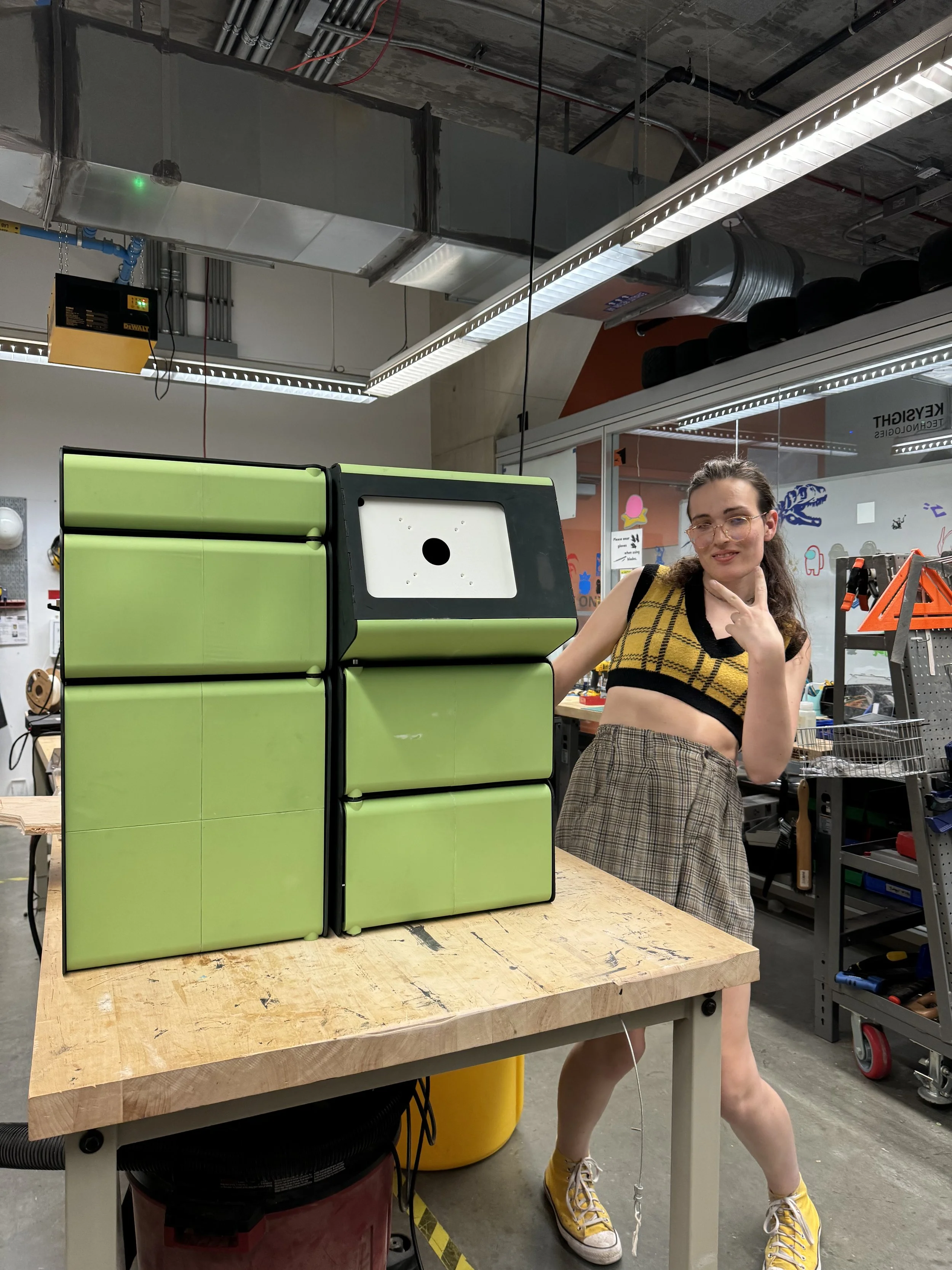
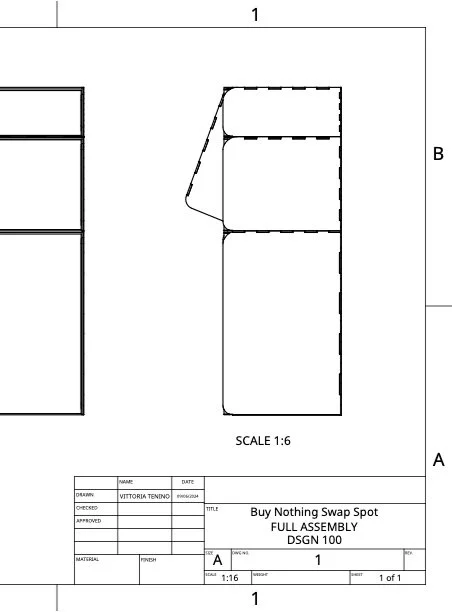
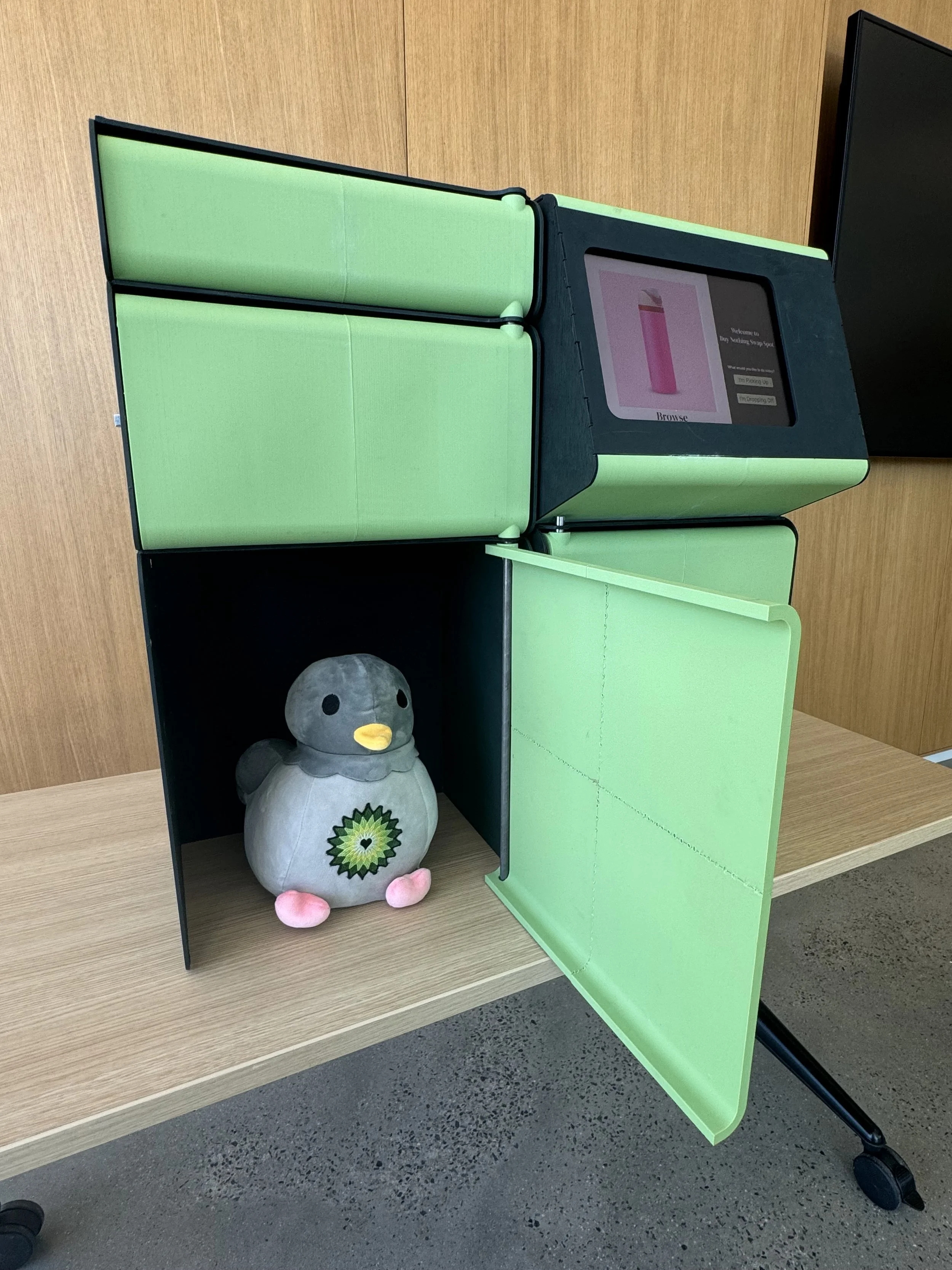
Physical Kiosk: After finalizing the design through mid-fidelity models, we moved to high-fidelity prototyping, where the kiosk was constructed with final materials. We used tools like laser cutters and 3D printers at a makerspace to create accurate and functional components, incorporating eco-friendly materials and secure locking mechanisms.
UI: The final stage of UI design involved applying the visual style guide, incorporating colors, typography, and high-resolution images to the wireframes, creating a polished and engaging user interface. The high-fidelity UI was fully interactive, allowing us to conduct comprehensive user testing to refine touch points and ensure a seamless user experience.
Outcome
Final Design and Fabrication
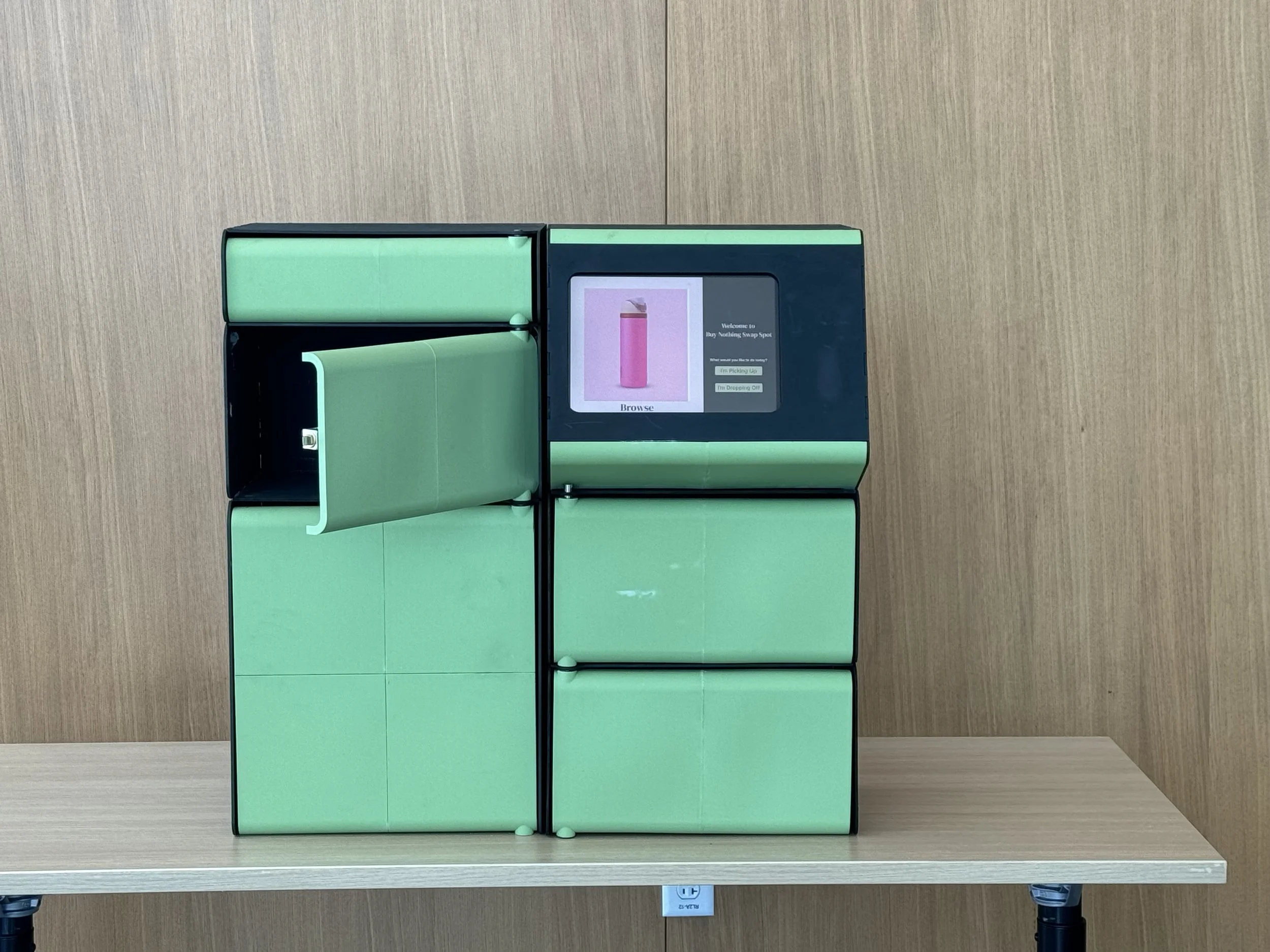
For the physical kiosk, we completed the high-fidelity prototype using durable materials, incorporating eco-friendly practices and advanced manufacturing tools like laser cutters and 3D printers at our local makerspace. This version included all intended functionalities, such as secure locking mechanisms and user-friendly access points.
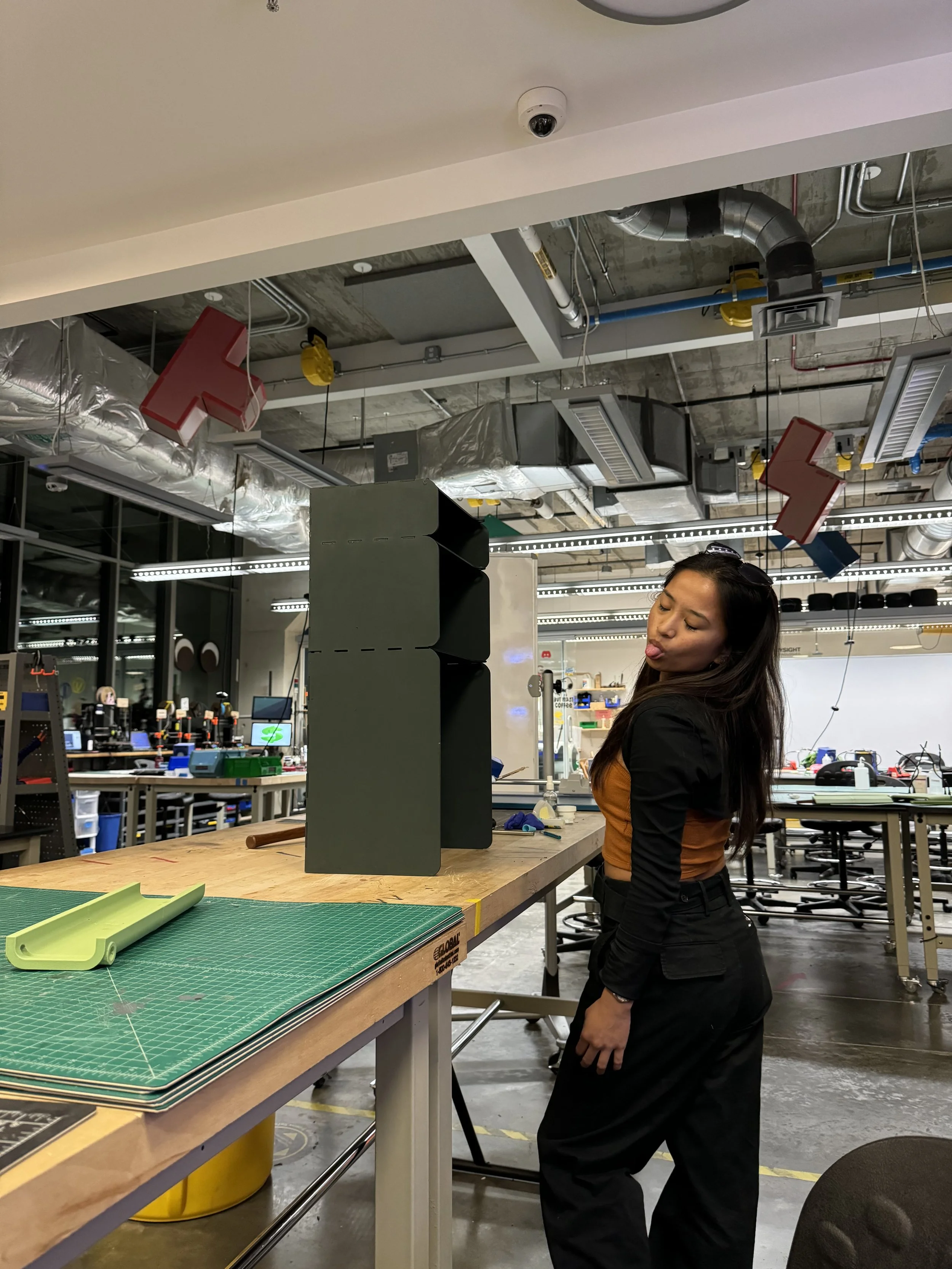
Moments from the Makerspace
The user interface reached its final stage as we applied the comprehensive style guide. We incorporated full-color schemes, custom typography, and interactive elements that were meticulously designed to provide an engaging and intuitive user experience.
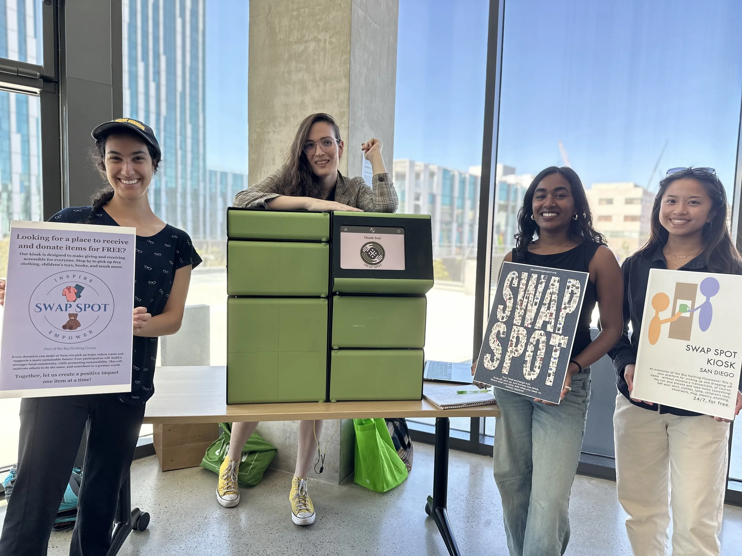
Once both the kiosk and UI were finalized, we presented the complete system to a group of over 30 users from our target audience, consisting of community members and design professionals. This presentation allowed us to conduct extensive user testing, during which we gathered valuable feedback on both the physical and digital aspects of the kiosk. The insights obtained were crucial for making last-minute adjustments and ensuring that the kiosk met the practical needs and expectations of the community, ultimately validating the effectiveness of our design solutions.


Reflections and Future Directions
Reflecting on the Swap Spot project, I'm genuinely pleased with how much we accomplished and the feedback we received during our presentation. It was particularly rewarding to dive into Figma for the first time on this project. Getting hands-on with such a powerful tool opened up new avenues for UI design that I hadn't explored before. Additionally, working on the physical aspects of the kiosk was an exciting sneak peak into industrial design. It was eye-opening to see how digital concepts can translate into physical forms, sparking my interest in blending digital and physical design spaces more in the future.
Looking ahead, there’s a lot of potential to expand the Swap Spot concept. Based on the input we've gathered, refining the kiosk to better meet user needs and exploring additional locations are clear next steps. We can also innovate further by integrating advanced security features like a camera and exploring new materials to enhance sustainability. This project has been an incredible learning experience, and I’m grateful to have worked with such a wonderful team who introduced me to so many different facets of design.


Mid-fidelity wireframes
Swap Spot in Action